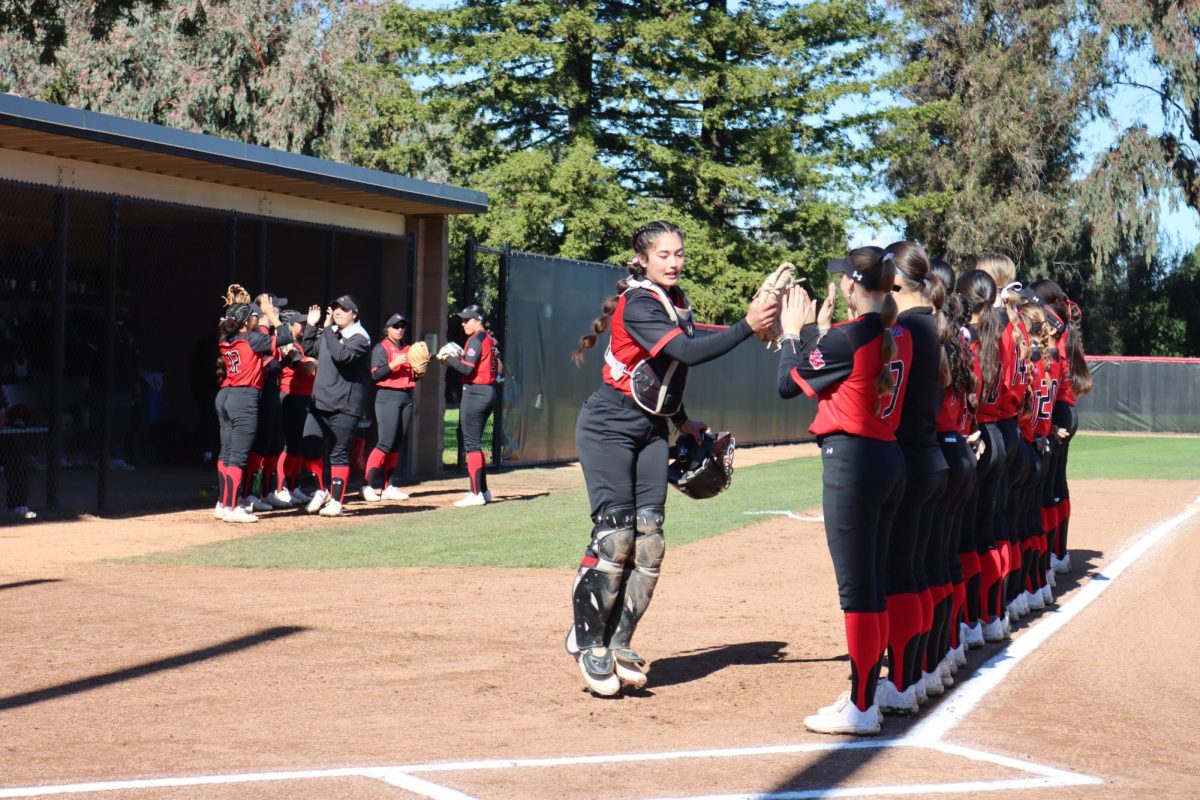

 From the Chicago Bulls’ red bull logo, to the Yankee’s iconic “NY,” fans across the world associate themselves with their hometown team’s logo. Sports organizations have worked with designers and artists for years to create the most easily recognizable icons for their franchise.
There are logos that never change such as the Yankees logo, or that “D” on the Detroit Tigers’ hats, but some organizations make modifications and changes to their logos as often as every 10 to 15 years.
Newer franchises go through frequent changes involving their logo, and that is expected, but it also depends on the sport.
Baseball and football teams tend to leave their main logos alone. Take the Oakland Athletics. Through moves from Philadelphia to Kansas City, to their current home in Oakland, the A’s have only undergone one main color change and a few tweaks to the “A.”
The San Francisco Giants have only made one logo switch in their 130-year existence. This switch was made when the Giants moved from New York to San Francisco in 1958.
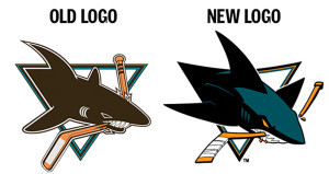
In 2007, the San Jose Sharks Hockey Club, founded in 1991, made a modernized modification to their shark biting a hockey stick logo. The Sharks partnered with Terry Smith, a Bay Area designer who worked on their initial logo to create a refreshed version of the shark.
Doug Bentz, Sharks sports director of marketing and digital media reflected on the organization’s decision to go with Smith.
“I think it’s very important that a designer really understands your brand and has some history with your brand,” said Bentz. “…He is someone who is at games, who is interacting with the team, who understands what hockey is about.”
Some teams make logo changes to boost merchandise sales, to appeal to a broader range of fans, or to give new life to their brand or image.
“A lot of times, people change brands to basically change their entire business.” said Bentz. “For us in particular, I think we were just really looking for somewhat of a brand refresh.”
With Smith’s design team working closely with the organization, they would create something that represented what the team and the sport is all about. “Hockey is about toughness, hockey is about intimidation,” Bentz said, “and while our original logo portrayed some of that, it didn’t portray all of it.”
After a bit of initial pushback, many fans began to agree.
“The new shark has crisper lines compared to the old one,” said season ticket holder Jonathan Wallunas, “It has a more aggressive feel.”
Changes made included more dimension and personality to the shark, the addition of teal on the shark’s back, and orange eyes. In an interview with Hockey By Design, Terry Smith added, “I wasn’t completely happy with the execution of [the original logo], so I was glad the Sharks organization came back to me to [give] me the opportunity to redesign the fonts and everything around it, as so much of it was originally put together in pieces by different people.”
Fans have an emotional attachment to their teams’ logos and jerseys, and tend to resist change initially. They are also never shy about voicing their opinion of new designs on social media sites.
The initial pushback by fans is something that is expected when making any change. Eventually, most come around, or just stick to wearing their old jerseys to games.
If you attend a game at the newly renamed SAP Center in San Jose, you are sure to see a variety of merchandise with the original 1991-2007 to the current 2007-present designs.
One thing is apparent through these changes; the shark is still one of the fiercest and most energetic logos in sports, and is respected around the league.